Wednesday, February 23, 2011

Rhythm, Tilt and Twist - Glen Keane


     Today I stood about five feet from a man who knows how to draw. You might think that a lot of people know how to draw.. But Glen Keane KNOWS how to draw. I listened for a few hours to all his knowledge and insight and it was very inspirational to see him draw and talk. Even though it seems as the drawing magically flows from his pencil, there is no magic, there are no tricks. Even Glen himself stressed that all he is doing is basic drawing principles.

      It might be comforting to imagine that good drawing takes deep understanding of the cosmos and the insight of line and only deities such as Glen Keane are genius enough to penetrate the mysteries of the pencil... (and all the animation geeks start slobbering on cue)
     But isn't it more empowering and motivating to know he accomplishes these great flawless drawings based on a few drawing principles we all learned in college? The only difference is that he executes THE PRINCIPLES while the most of us forget them.

Glen Kleane stressed three words over and over.. Rhythm, Tilt, and Twist. When a drawing looks bad, it most likely lacks either one or more (rhythm,tilt, or twist) DANNY WHAT DO THESE WORDS MEAN?? TELL US HIS SECRETS!!!


RHYTHM: (see picture above and below) The over all movement of the drawing. IT IS NOT the line of action. The line of action is a huge understatement of what rhythm is. Rhythm is how each line curves into the next. And how each line contributes to the over all shape of the drawing. Glen Keane used a river as an analogy. He said imagine that you view a river from above, and you see the curves and the bends the water makes and how the landscape controls where the water flows. Everything works together to give the river it's overall rhythm. So in a drawing, every line flows and curves into each other creating a rythm. it'll capture your eyes lead it around the drawing in a sort of dance.


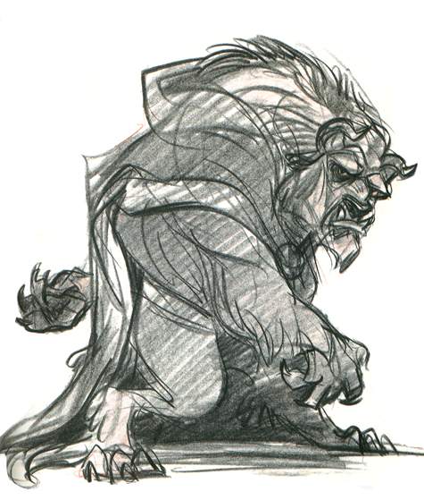
TILT: A very basic principle, if your hips are tilted one way, your shoulders are tilted the other way, and then your head is tilted the opposite way etc etc. Glen said if you ever have a stiff drawing, it's most likely because it lacks tilt.


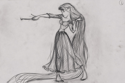
Twist: Instead of standing figure looking at you straight on you can add some twist to it. The legs are one way, while the torso is facing another.. You can draw lines suggesting the 3D Form of your character even though it is literally a flat drawing.


       It was a real treat watching Glen Keane draw in person. it was fun watching people geek out over Glen Keane in person. I'm never one to geek out over people like Glen or Deja. Even when I first started working at Pixar and I would see Pete or John walking around. I wasn't raised on animation. I'm not an animation geek nor do I really worship any ones style in art. I respect and am interested in artists and recognize when they are VERY talented.. but these people are just people. They are artists and you all have the same potential inside of you to do what they do. It when you start to worship these artist like gods that you disconnect with their art. You imagine their art to be heaven sent when in reality it's made with human hands.. just like yours. Do not distance yourself and your dreams by imagining that there's a kingdom where only great artist live, great artist look like you and me and live in one bedroom apartments too. So next time you are about to geek out, try to calm down and breathe... because people can smell someone geeking out a mile away and it's not sexy at all. Stay classy.

-Daniel Gonzales

Sunday, February 13, 2011

The Magic of Timing and Texture


Timing: is the time when something happens or the spacing of events in time.
Texture (Music): is the way the melodic, rhythmic, and harmonic materials are combined in a composition

       The understanding of these words will help your work like how toilet paper helps you out when you really need it...

Seriously..
     The use of Timing can sell a point or emphasize a moment. The use of Texture can communicate a feeling or can be used to build and keep interest in a piece over time. These words by them selves are concepts but with a medium applied you can get an experience.
     Usually these two concepts are used to help improve the piece of animation or film, but rarely do you see an artist try to show off Timing and Texture all by themselves, or at least give them the spot light. It's a hard thing to do.. so DO IT. Walt Disney gave it a shot with the movie Fantasia. He did it with the help of classical pieces of music and great animators. In the film Fantasia, Disney uses traditional animation with western story telling as well as some abstract conceptual animation. The experience of the animation was amplified using the perfect timing and texture of the classical music. But Disney wasn't the first to do this and he wasn't the last.
     This is a recent piece form Director Joe Write. He uses color and light as his medium. (I wasn't able to embed this video so here is the link) It kicks ass... or.. um.. .. your eye's and ear's asses...  ?

AMAZING TIMING AND COLORS and TEXTURE

     If you do not know what is so special about the video in the link above, you need to STOP (breathing) and find out from someone who likes music. Maybe this next short will help you out. This short doesn't only use color and shapes with timing and texture, it uses characters.. but not in the way you might expect. One thing that makes this short stick out to me is that it still not only keeps your attention with very nice use of timing and texture, but it has a thought behind it, a message to say. Which I think saying something or expressing a thought is always the full potential of any medium. Here is David O'Reilly,


The External World from David OReilly on Vimeo.

      If that wasn't your cup of tea, ..don't drink it. But still learn the importance of Timing and Texture. That's all for today and I swear I swear I'm going to load my animation up soon. But crunch time working on cars2 keeps me late at the studio, so THAT takes priority over the blog.. hope you understand.

-Daniel Gonzales

Sunday, February 6, 2011

A Critique of Blocking

Here is a recent critique I did. Thought I'd share because it deals with the blocking stage of animation, and people always fine this the hardest part to get through. So hope this gives insight.

Next post on (SOME TIME BEFORE FRIDAY) will be my side animation I've been working on.


THE LETTER in raw form:

Hey ______,

      Very very entertaining. Things to tweak but not things that you missed. Just PUSHING things you already touched upon. Which is very good. This means you are not missing the point and there for do not have to learn anything from scratch. So far so good _____. 

So in this long ass critique, I'ma talk about two things. SELLING YOUR IDEA and ANIMATION. The latter being just regular animation notes and the first one is mostly about your CHOICES, not your technique. Second one skill, first one Personal. Cool? ok.. here we go...

SELLING YOUR ANIMATION-
    Your audience is number one number one number one. You are doing character animation so your audience by default is number one. Character animation isn't conceptual or just animation for animations sake, you are doing it for your audience. 
    Your idea gets across. it's gum. on a shoe.. and he wants it off. YAY, but don't pop champagne bottles over this just yet. As a character animator to get the idea across is NOT THE POINT. (And if you get ANY ONE THAT SAYS OTHER WISE give them my address so they can come to MY HOUSE and I can tell them personally. [bc I'm not going to go waste my time going to their house to tell them something I know..]) I repeat, to get the idea across in an animation is not the FINISH LINE. You have to make us experience with the character what the character itself is feeling. The point as a character animator is to make us Feel what the character is feeling. And we do this by emphasizing story points and having good acting with correct timing to compliment the mood. Movement has texture that highlights whats important and what is not. everything works together like how all the muscles in the arm, back, and torso controls a ballerina's delicate arm motions during a performance. 

Ok, Now to business. ~FRAME 51: this pose. THE MONEY POSE, this is the pose your whole assignment is revolving around. very nice. Clear silhouette. BUT you only give it 12 frames for the audience to register it. You need more. Here's why:

-You give the walk more than 20 frames..You give 37 frames to pose after he looks at his foot (the OH SHIT WHY ME pose i call it). 25 frames are given to the nice entertaining walk to the edge of the curb.. You give 20 some odd frames to him scrapping the curb with the bottom of his shoe.. 30 frames to scraping the sidewalk with his shoe at the end.

    Just about every action is given more attention than the crucial pose on frame 51.. You give it 12 frames AND you still have to ease into it so i say you actually have given it 6 frames. So when starting an assignment here's what I look at.

'Can I take out this Pose/Action and the assignment still make sense?'

      There are only 2 poses/actions in your shot that if we took out, would cripple your shot: The Walk and The First Look underneath the shoe. Everything else is icing on the cake. So priority is always to be given to these two poses. the walk is fine. :) but you neglect the Look at the Shoe pose like a little red headed step child. haha. Give it more time and you'll be fine. 
    PS. I know your limit is 200 frames, I'm not insensitive to that, and I do recognize the feet sliding at the end is actually some of the most entertaining animation you have in this assignment.. My solution?  You have TWO foot scrapes on the side of the curb.. Make it ONE. Take that time and add it to hold your story telling pose (first look underneath foot)

That's just one note.. hahaha

(DISREGARD this note because I just found out that the eyes cannot be animated.)
Ok second note. I know i know you are short on frames. Other wise I would say to make the second look underneath the foot longer. BUT you can't. bc of restrictions.. doesn't mean we over look the note. Can his eye's be animated in any way more than a blink? If so, please atleast show him get angry in that pose (only in the eyes) it would really compliment the last foot sliding action. The foot sliding action right now comes out of no where (which is funny) but you can not REALLY make it come out of nowhere. everything needs a lil anticipation. so his eyes getting angry (that the gum is still there) is his anticipation to scrapping the shit out of the gum until it dies :)

Other than these two notes I hesitate to say more. bc I really want your idea to shine and be made to work. This is where as commentator I have to recognize I am ONLY a commentator and not the animator of this shot. I am to improve it not change it to make it my own. Only supply changes that can help make it stronger. 

I won't talk too much of specific animation notes bc this is just blocking. Just watch your arcs. (heels, torso, hips, shoulders, head, knees.. EVERYTHING in other words) watch momentum (inertia), and remember to keep your poses and not lose your timing when you move forward with this. 

ONE real fast animation note. The foot scrape on the side of the curb.. very nice. nice leg animation and head animation... even good side to side hip animation! BUT try doing that action in real life... to keep your torso at that height with out going up and down during scraping GUM of the bottom of your shoe... not possible... unless it was a sissy scrape...

So watch out for that. When doing a physical action YOUR TORSO WILL ALWAYS BE MOVING. every avar. even if it's just a little. Never should be flat flat flat in your graph editor. so watch out for that.

Hope everything goes well. I am very excited for this shot and look forward to seeing you progress on it. Your going to do fine.This blocking already kicks ass as it is.


PS.. ima post this on my blog..


:)

Daniel Gonzales III