-Don't worry I'm back. I just had to give 110 percent to this class I'm teaching and had to put the blog on the back burner. But that sissy era of non-multitasking is done, time to get this blog back up and running (but odd fact of the day: This last month I had the most views I have ever had and I didn't even post anything!!!.. what does it mean)
BALANCE 101

One of the first things I learned about art was by accident. I was in 6th grade, drawing my awkwardness away, when I noticed that some arrangements of things I drew worked better than others. I didn't know how but they just did.. The drawings were pleasing to look at! Looking back I can now say I was noticing good composition and balance skills in the making :) But some people don't have that epiphany, so I thought I'd do a little post about: BALANCE
Definition: (here's a definition I found online, lets take a look)
(noun) - As a basic principle of art (specifically of design), balance refers to the ways in which the elements (lines, shapes, colors, textures, etc.) of a piece are arranged. Balance is one of those useful terms to know, if one is to employ Art Speak. (If you want to sound artsy, learn how and when to use balance. Do not go into an art school saying: This Lendo fool decided to drink more to be balance and not feel it.)
Balance can be symmetrical ("formal"), where elements are given equal "weight" from an imaginary line in the middle of a piece. For the most basic example of symmetry, think of your eyes in relation to either side of your nose.
 |
| SYMMETRY |
Balance doesn't necessarily mean symmetry, though. Asymmetrical ("informal") balance occurs when elements are placed unevenly in a piece, but work together to produce harmony overall.
 |
Confused? Symmetry is balance, but symmetry doesn't happen in nature so its not as appealing than Asymmetry. Even with a seemingly unbalanced image, one still has to be able to visually balance an image using elements of design. A few are elements of design commonly used when balancing an image.


- shapes and their proportions
- Your frame: what you crop and choose to show
- negative space
- contrast in value
- breaking these rules: creates tension and unease.
Rule of thirds is the easiest way to help balance your image, putting your image smack dab in the middle is technically a balanced image but that doesn't mean it is interesting. When you come up with creative ways to balance your image: such as rule of thirds, it adds interest to your image. Below is an example.
 |
| As long as there's no context, The image on the Right has a balance that is more interesting than the image on the left. |
Rule of threes: Odd number of subjects in your image will always be more interesting than an even number. Even number of objects suggests symmetry. When there is an odd number of objects the eye will assign arrangements for the subjects.
Balancing an image with space, usually this technique is another way of using the rule of thirds. Another way of thinking about the rule of thirds is that you are balancing the image, not with objects but with space, If you put the object on one side of the paper and if there is enough space on the other side, then your picture will be balanced. You can also create space with simplifying the image
More examples
A quick search of the interweb and I found these images. They demonstrate balance in a very simple way: Here are two squares on a white plane. a smaller square that has more contrast can balance more space than a small dull square. The less contrast a square has the larger the square has to be. The same applies for a square of color.
A quick search of the interweb and I found these images. They demonstrate balance in a very simple way: Here are two squares on a white plane. a smaller square that has more contrast can balance more space than a small dull square. The less contrast a square has the larger the square has to be. The same applies for a square of color.


....A complicated shape has the same effect as well as texture.


So it's a simple context but it can be difficult to master. When you are unsure if your image is balanced, you have to go with the aesthetics of the image (Aesthetics is a fancy word that basically can mean: what your gut really thinks about the image) If it feels wrong, then your image is probably unbalanced. If you are still unsure ask somebody! Receiving feedback is the best way to check if your work is communicating your idea.
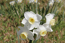
WILDCARDS!! Test yourself.. are these images balanced??


Hope you enjoyed the post! If you are interested in the online classes I teach please feel free to email me about them. I also will post when my next class starts, so check back in once in a while :)
-Danny Gonzales